3 Tips for Laying Out Long Quotes
- Flourishing, Copperplate
- 0 comments
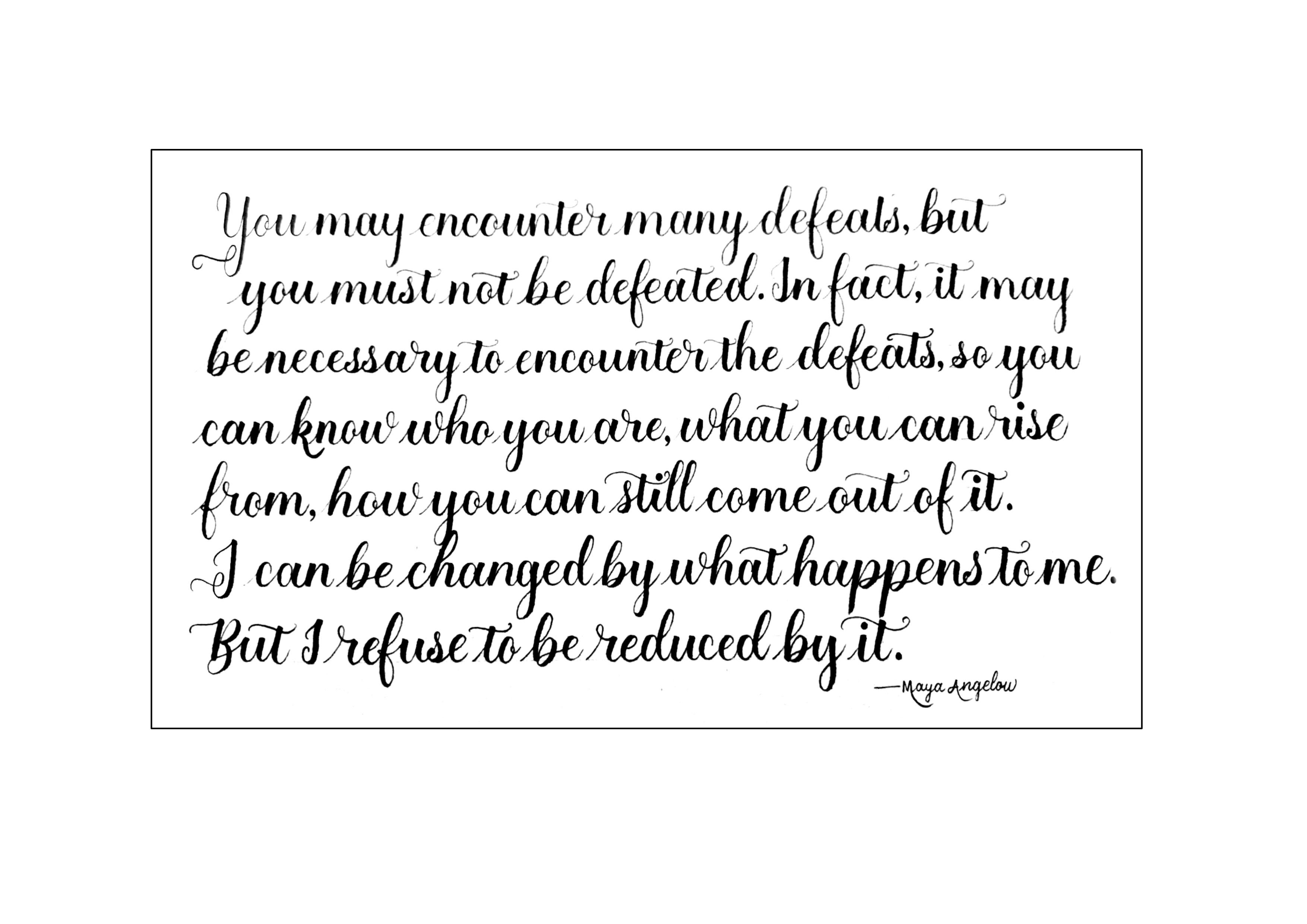
A subscriber emailed me recently — she wrote a long quote for the first time 🥳, and was asking for tips on layout.
With her permission, I’m sharing with you 3 suggestions I had to improve her piece from this …
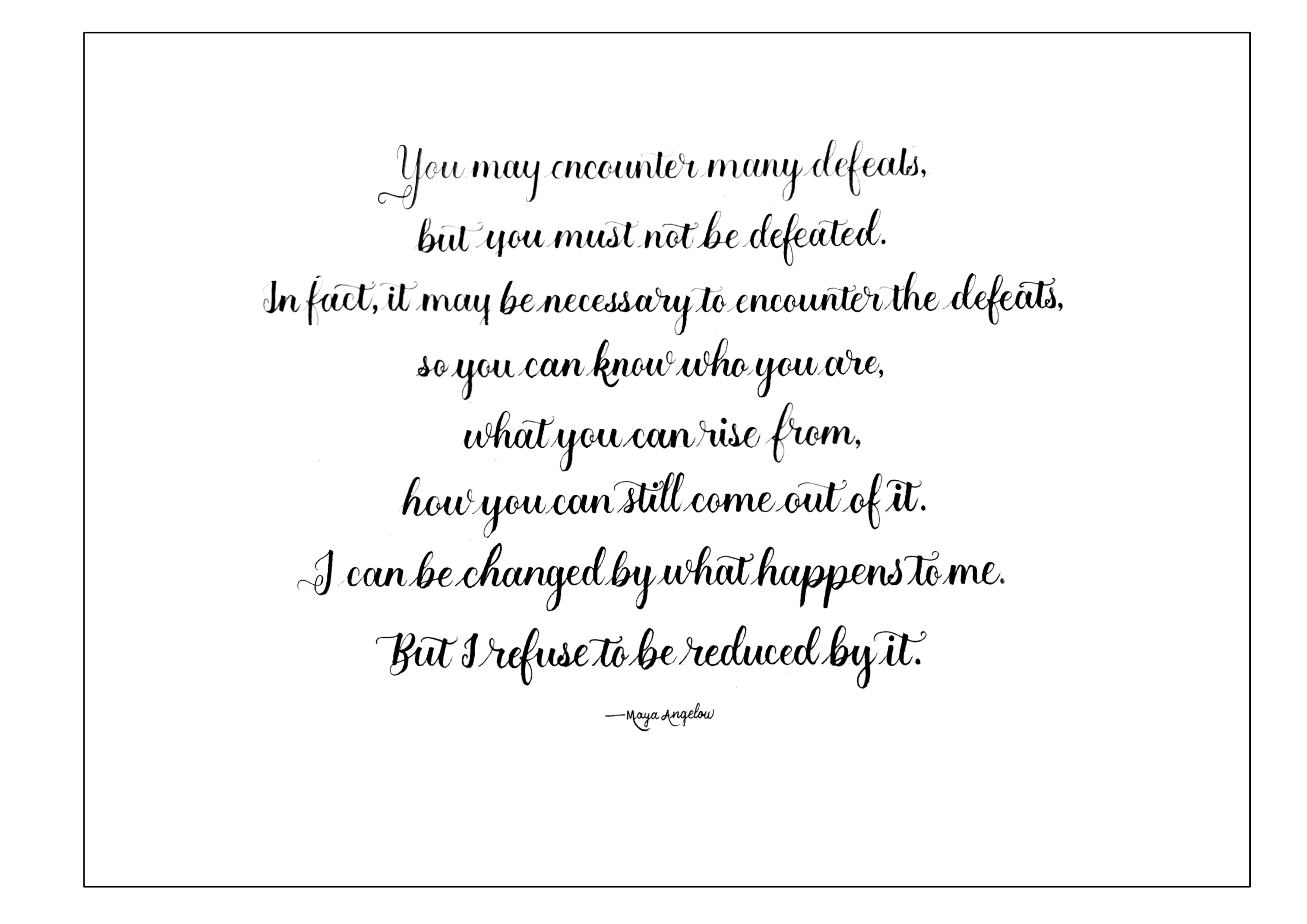
To this…
1. Adjust interlinear spacing
One of her biggest struggles was descenders and ascenders clashing.
The fix is simple mathematics!
Adjust (or in this case, increase) the interlinear spacing, which is the spacing between lines.
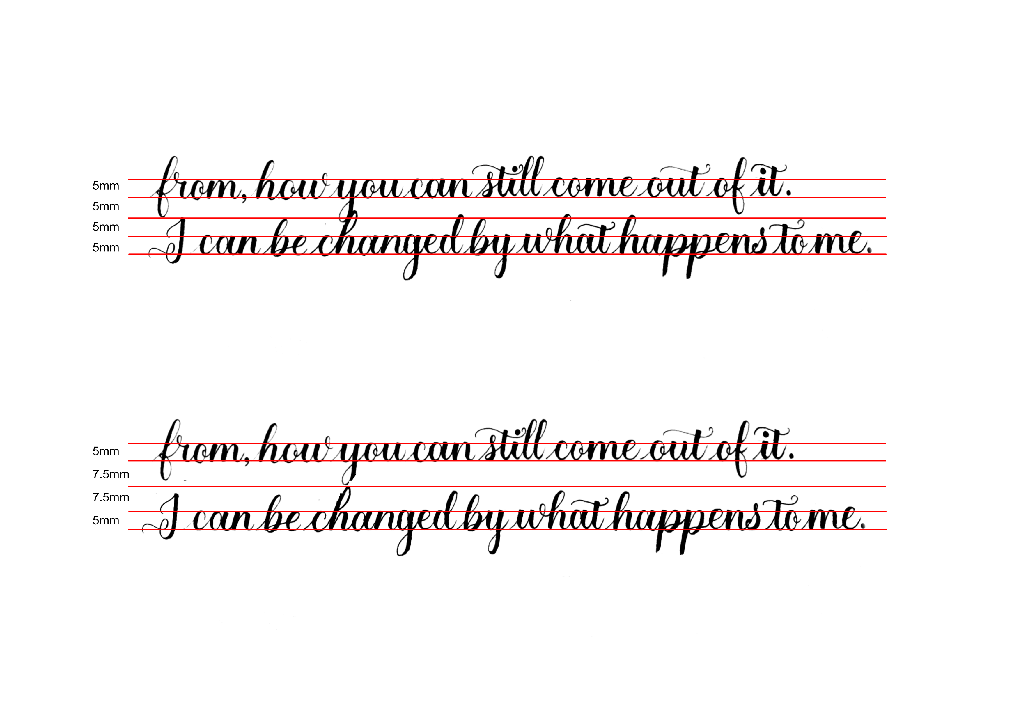
Let’s break it down.
Say your x-height is 5mm. Each ascender / descender will be 7.5mm with a 3:2:3 ratio, or 10mm with a 2:1:2 ratio.
So to prevent clashing, your interlinear spacing has to be at least:
7.5mm x 2 = 15mm for 3:2:3 ratio
10mm x 2 = 20mm for 2:1:2 ratio
Tip: I personally use a grid sheet for long quotes. It’s easier to adjust the interlinear spacing by counting the number of rows. (But since it’s in multiples of rows, you have to follow a 2:1:2 ratio.)
2. Make it easy to read.
Don’t break the quote into separate lines based on similar widths.
Instead, break the quote into lines where it makes sense.
Each line should read smoothly on its own. There shouldn’t be any hanging words.
Make it easy for others to read and understand the meaning behind what you’re writing.
For example, I would break down this quote into:
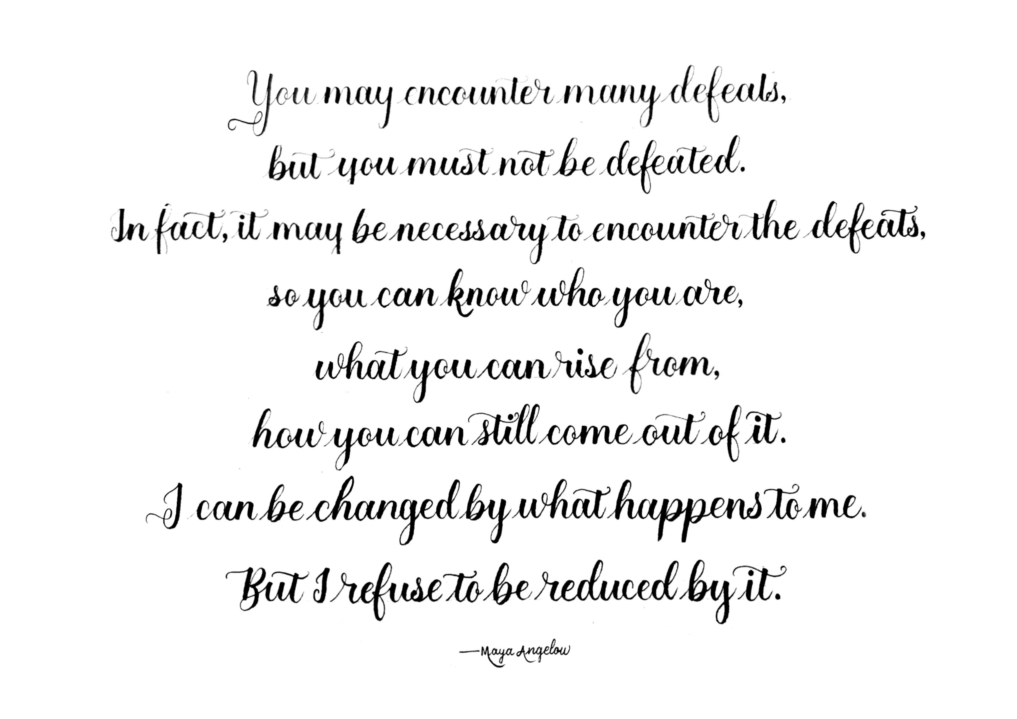
You may notice more negative space at certain spots (e.g. the left and right of lines 4 and 5), but I actually think it adds visual interest and texture to a block of text.
3. Increase margins.
Most beginners tend to be uncomfortable with leaving negative space (unless you’re already well-versed in visual design).
So it’s common to cut the paper tightly, leaving little margins around the text.
But leaving ample margins around the text actually draws attention to and centres your calligraphy.
So don’t be afraid to increase your margins.
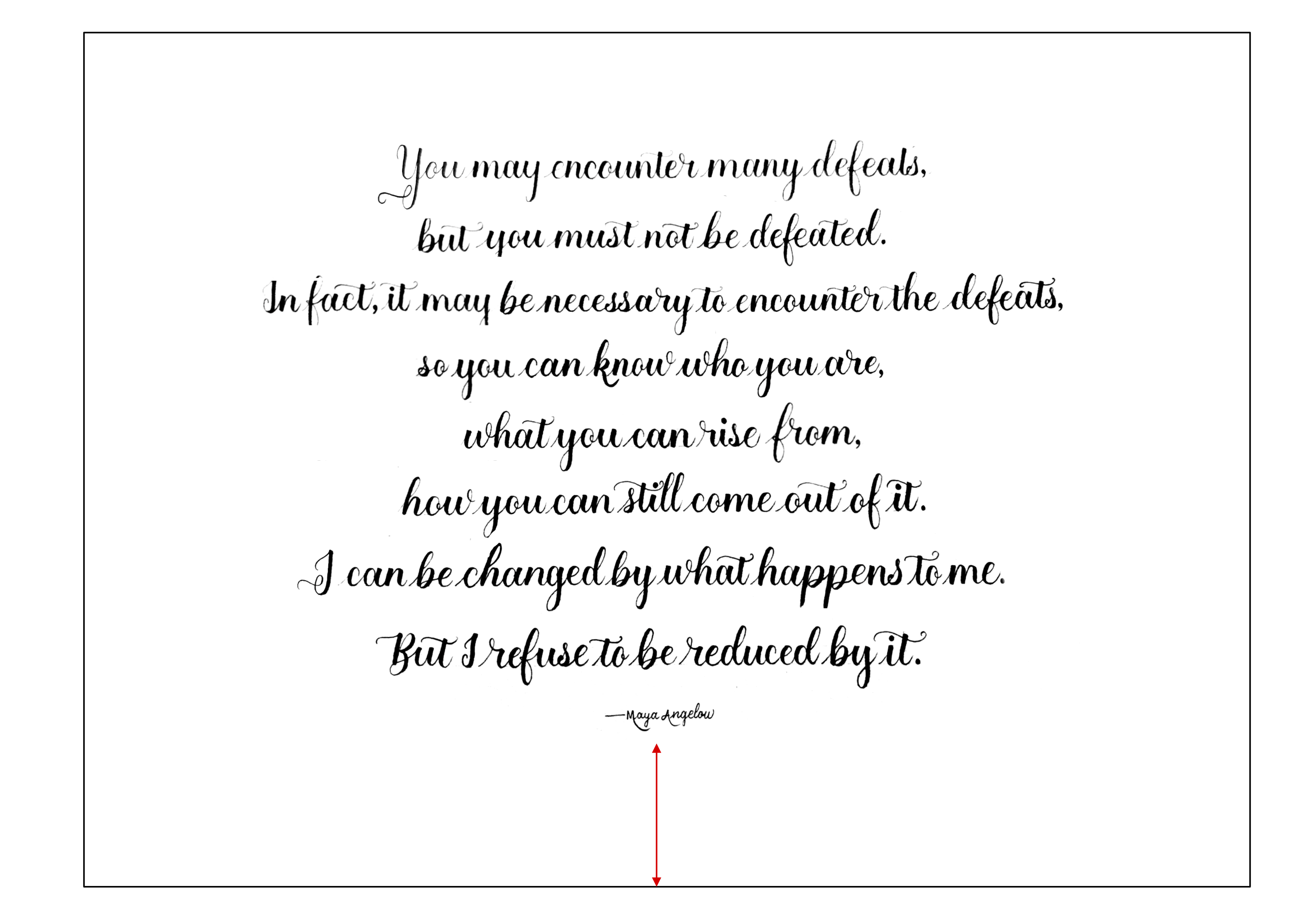
Another tip — leave a larger margin on the bottom. This keeps your calligraphy in the optical centre where the human eye tends to land on, which is slightly above the mathematical centre.
I hope these tips give you a bit more confidence the next time you tackle a long quote! ♥️
This was first published in my email newsletter, 💌 Curious Letters, where I share tips and stories about calligraphy.
To receive emails like this one, sign up in the footer ↓ down below.
→ hey there
I’m Dawn from Singapore.
After leaving a corporate job in the throes of the pandemic, calligraphy has given me more than a hobby and a creative outlet.
Calligraphy challenges me to keep learning, helps me to calm down and focus, and has connected me to so many calligrafriends around the world.
Drop me an email at any time if you have questions / problems while learning calligraphy, or just want to chat about calligraphy! ♥️